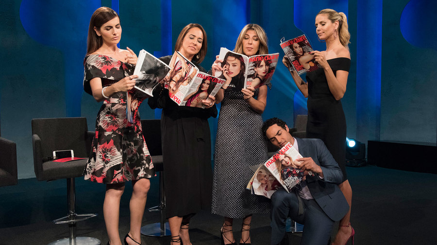
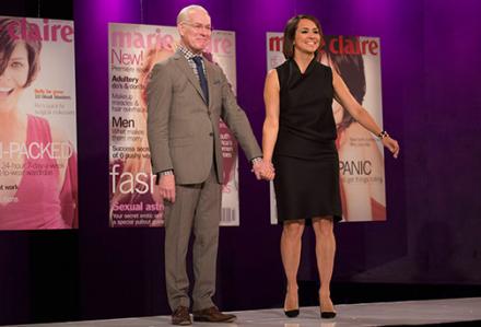
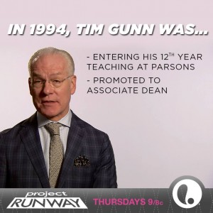
Just kidding! But wow, how many movie references did we get in this episode — Clueless (Team Kristine now for sure, lol!), Star Wars (Ewok talk), The Matrix, Planet of the Apes, Mary Poppins — that was all right?!? As for the real challenge this week, the designers received their marching orders while sitting amongst a sea of Marie Claire magazine covers. Tim Gunn and Marie Claire’s Editor in Chief, Anne Fulenwider, provided the details for this week’s challenge. Anne was also one of the guest judges this week.

The challenge revolved around the celebration of Marie Claire’s 20th anniversary, 1994-2014. The challenge details — to use the Marie Claire magazine covers, from 20 years ago, as inspiration to create looks the designers feel would be relevant 20 years into the future. Really the designers could use any past inspiration to create their look, but the point was to imagine what could end up in Marie Claire in 2034! It’s the future of fashion thru the designer’s filtered aesthetic!

Everyone enjoyed trips down memory lane — images from 20 years ago and tales of times’ past. Most of the designers finally enjoyed their 1st trip to Mood! So the designers were then off to shop with their $200 budget for this 1-day challenge. Kini was so cute during this episode! I’m sure just as he exclaimed, everyone was so happy they could finally choose their actual fabrics!

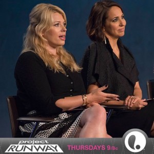
There wasn’t a lot to report this week from Tim-time to model fittings to the morning of the runway — nothing out of the ordinary — some craziness, Tim cautions, panics — the usual! There was one additional guest judge this week and that was renown British photographer & TV personality Amanda de Cadenet. So with no further delay, the runway was surprising on many levels this week!
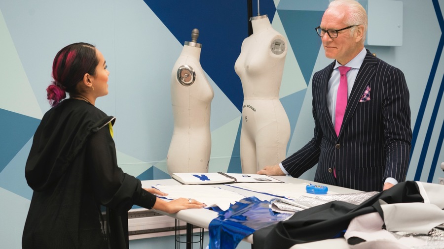
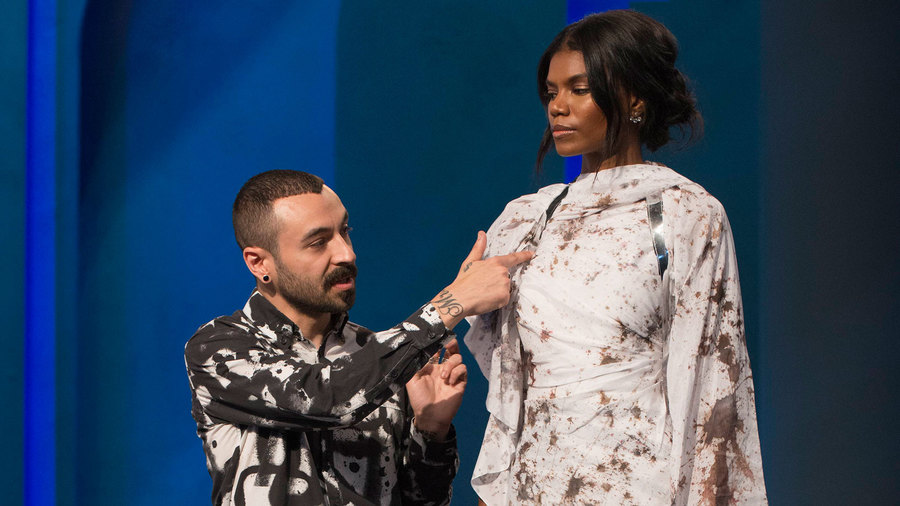
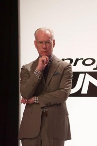
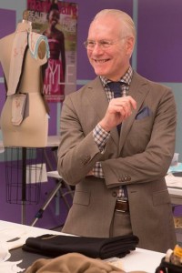
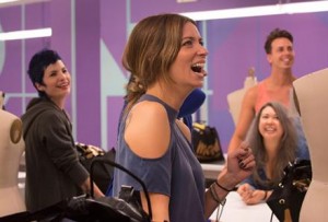
So thankful that Tim provided the perfect examples for facial expressions I had during this episode. As I saw the designers working, the future for sure looked dark and cold, with the exception of Mitchell who had a wet future in mind! I thought “Boy, this runway will be disappointing, bleak, dark, gloomy!”

But then as the runway show commenced I became ecstatic, pleasantly surprised!

Many of the designers really stepped it up this week. I was impressed! As the results were coming in, I will say, Heidi’s extra commentary and blasting, as she did on Angela last week, was again totally unnecessary for Amanda! This expression of hers quickly faded!

But again, very annoying comment by Heidi. After hearing who was in the bottom 3, there is no way Amanda would have ever gone home and I’m not certain she would have even ended up in the bottom. But as far as facial expressions go, my face went back to this as all of the final results came in, mainly the winning look.

This season, thus far, has been so conflicting. Generally my frustration comes from the bottom looks and who goes home, not the top looks and resulting winner. I’ve been trying to formulate my thoughts and critiques for Sandhya so that it doesn’t come off that I want her gone or that she doesn’t have potential. In fact, my only true negative thought about her was from last week and it only came about because the judges said she had the worst look and were it not for her immunity, she would have gone home. I agreed — she had the worst look. That is all hard to let go of.
But my issues really boil down to these “wins” she’s being given. It doesn’t make sense. The logic is just not there. And clearly from the many viewer comments I’m seeing, I’m not alone in this. And the main issue then that her questionable wins create is from the resulting immunity. Because as we saw just last week, immunity saved her, not her talent. I don’t think this will continue to happen. And I hope it doesn’t because it should be her talent that keeps her in the game, not the immunity. But so looking at this week……

I had no issues with Sandhya’s look this week. Was it my fave or in my top 3? No! But I definitely didn’t have it in my bottom 3 either. So just as the 1st week went, okay, she ends up in the top, fine. But to win again, especially after I intently listened to the judges comments makes 0 sense to me! What makes even less sense is Sandhya, even though in the top, still received negative critiques. Heidi called it comical and did so at least 3 times. She even made the comments as she was critiquing the other ladies in the top. So clearly she meant business and usually Heidi’s say-so is more of a final say-so. Kristine on the other hand had 0 negative comments about her actual look. The only negative was from Nina and that was on her make-up & accessory choices. So this is why Sandhya’s win makes 0 sense to me. Kristine had all 5 judges’ support. At most Sandhya had 4, and maybe even 3 because Zac didn’t sound fully convinced during the later up-close critiques. If the judges are going to undeservedly give a win, then at least be positive during the critiques, as they did the 1st week. It still might sound like BS, but at least the comments will match up to the result!
I will end on a positive though for Sandhya — great job working with the Mary Kay team for a futuristic beauty look. It really amps up the runway more so than the same deep purple look pretty much every other designer made use of this week!

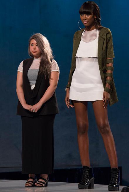
So let’s now take a look at Kristine’s garment, which was actually 2 pieces as compared to just 1 — a jacket with cut-outs & a chic white dress. I will say I agree with Nina. The huge hoop earrings and bubblegum pink lip were not great choices. But the ensemble as a whole, really fit the challenge. There is very much a futuristic vibe here, but practical futurism, not comical, which is the term Heidi used a lot during the critiques. Kristine took inspiration from the movie “Clueless”, which came out in 1995. She took elements from the various wardrobe pieces in the movie to translate into this look. And this makes sense because fashion is often about bringing back trends and elements, and I applaud what she did here. The look was editorial, edgy, and had lots of great details. I would totally rock this look. I feel as if Kristine was robbed of a moment here and hate that it was done so with no real explanation!
And rounding out the top 3, a surprise in my book, was Emily! Just for the sheer fact that Emily stepped it up so much this week, I would have been fine with her winning over Kristine. This is of course assuming the judges comments matched up, lol!

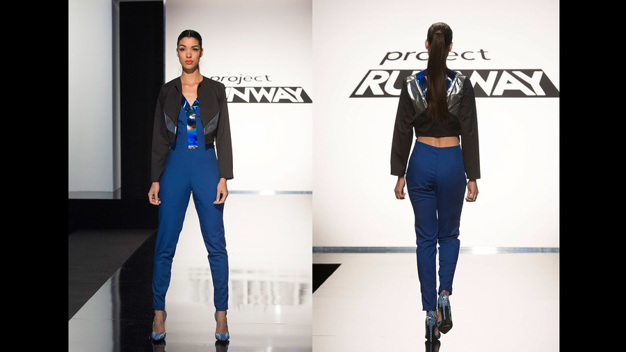
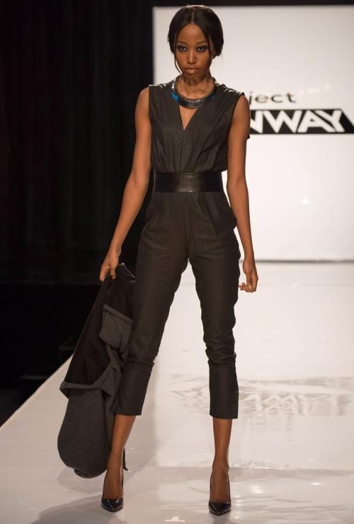
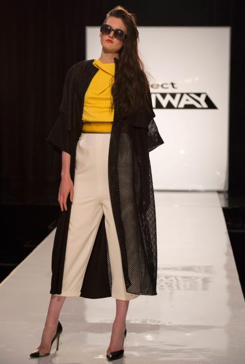
Emily seemed weak the 1st two weeks for me — the design, execution, etc. But it wasn’t enough to call her out on and I’m glad I didn’t because she turned it around here. This look, altogether, kicked ass. The jumpsuit had such a great fit and I loved it was cut-off instead of longer. The cover-up was also great and perfectly executed. I think this is not just any typical jumpsuit that you see all the time. The cut and silhouette is what brings up a futuristic vibe for me, the going back to a style likely seen 20 or 30 years ago, but with a modern take. I think layering is a concept many designers used during this challenge as well. And I think that very much speaks to the future of fashion. For me, this is great work that is very much deserving of high praise & recognition! She also gets high marks from me with the entire package — Aldo accessories (perfectly coordinating black pumps, great statement necklace), Mary Kay beauty look (love the smoky eye!), & Philip B. hair look (what a chic and amazing up-do!).
The bottom was more so obvious this week. It was surprising that Alexander & Sean ended up there because they started the show off pretty strong. It made sense that Sean was not the bottom 2 though.

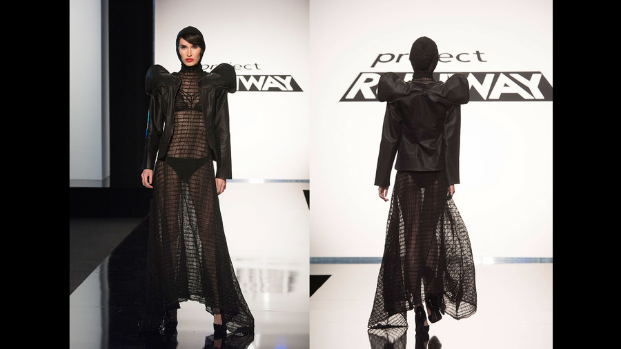
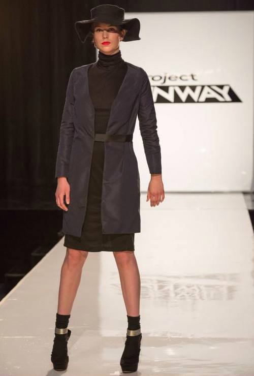
I love the Aldo black booties, but not for this outfit. I also loved the hat, very impressed he took the time to make it, even though it meant he had to rip up the poor Mood bag. But maybe he should have not worried about the hat and more on the garment. The judges said something about people not liking turtlenecks. I love turtlenecks! But the issue here was the jacket. All in all it just looked frumpy. And what was with the wrinkles and crooked hem? There was still some decent design elements here so I think that is what saved him and I know he can bounce back! I mean that straw dress was phenomenal just last week!
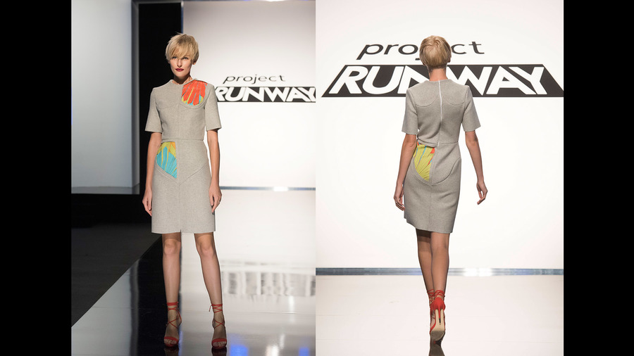
Alexander was also a surprise this week, but it’s clear what happened here. He screwed up his first executed idea, panicked a bit, had not a lot of time left, and this is what we end up with!

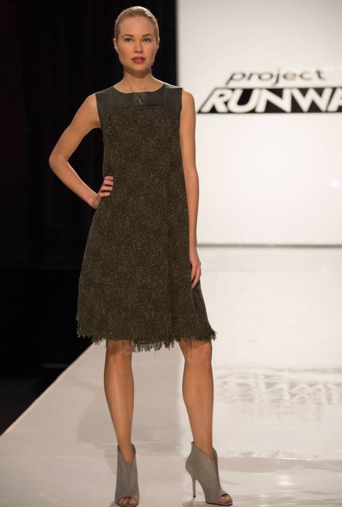
This textured dress was pretty much just a yawn — so plain, so simple, so basic. There just wasn’t much here to critique. And what is there to critique, it’s not good. The hem seemed sloppy, not intentional. The fit was not great either, too loose! I did like the grey Aldo peep toe booties though!
But I think that it was obvious he would stay and Angela would go being that she ended up in the bottom again, was harshly criticized last week, and continued to receive a great deal of screen-time attention as the episode progressed.

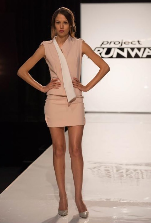
Angela had a great idea here, as the judges mentioned. But there was some wrong moves here — the color, not typical for Wall St. or a business suit and too much of a stretch, even 20 years from now! I think she should have maybe done a shade of blue or even green if her goal was to steer clear of black or grey. The look was also far too tight and short for a business suit. I’ve worked in professional environments for close to 10 years now and this type of look would certainly get me some attention, but not in a good way. Again, great concept, just not well executed. And I think because other designers had not been negatively focused on, it just didn’t work in her favor this week.
And finally, a few other shout-outs…..

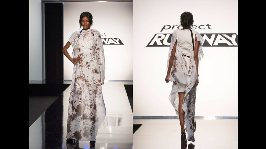
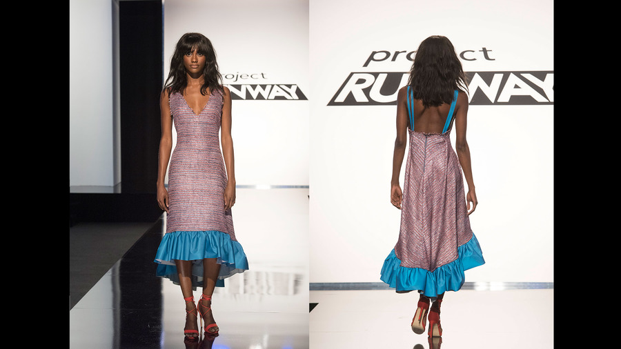
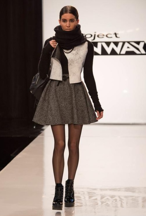
Samantha I feel was also a bit robbed this week. This look not getting any recognition is just sad! First off, we all can count right? Look at how many pieces she created in just 1 day! And not just made, but they all look well-made. I really feel as if this is a whole look, more so than just a basic dress. Samantha’s future didn’t seem comical as Heidi kept saying about someone else’s work. And it’s futuristic, just not over-the-top!

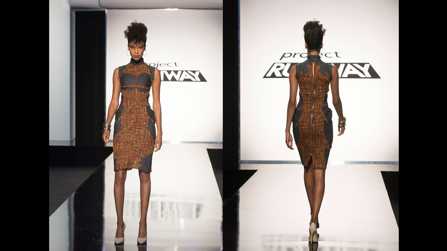
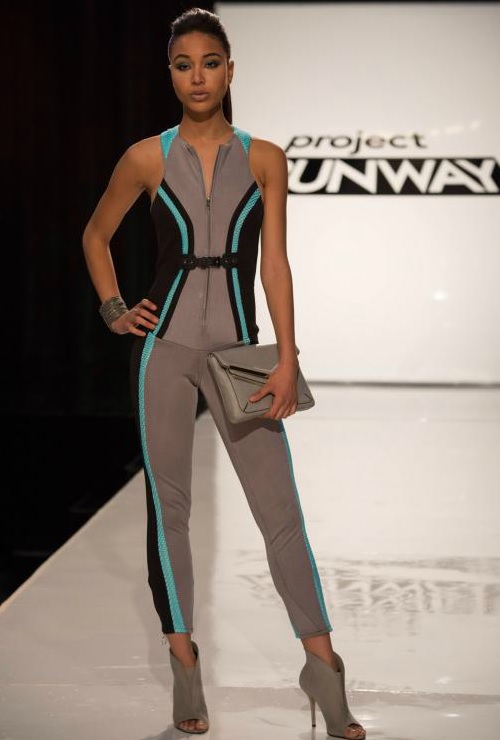
Mitchell’s look I’m still contemplating over. I have to be honest, sometimes I look at it and I don’t like it. But other times, I kind of dig it. I definitely would love to see this top paired with jeans. I think there is something here, but the reason for my shout-out is because of the Aldo accessories (loved the grey peep-toe booties & coordinating clutch) & the Mary Kay beauty look (anything besides the purple or violet lip many others used!)

And finally, Korina’s shout-out is for her Aldo accessory selections (love the sheer mixed heels & hip sunglasses), but also the Philip B. hair look since there were so many up-do’s this week. It was nice to see someone rockin’ their luscious tresses!
